background

Friday, December 13, 2013

                                       Green Bar


Artist:                Susan Rothenberg (American, Born 1945)

Date:                 2008                                                      

Medium:           Oil on canvas                                      

Dimensions:     88 x 66" (223.5 x 167.6 cm)              

  My first impression about this painting was very surprising. I wasn't actually trying to feel the emotions that went through this painting, but I was surprised of how simple and strong this painting was. It shows 2 pairs of handicapped legs and a arm. The first pair of legs set in the middle of this piece shows tire marks at the top as if it had been run over by a car. You can also see two hands at the top-right corner trying to assemble these parts back together. I also noticed that there are a lot of negative space throughout this painting. This could represent that there aren't many people who are disabled, considering there are only two pairs of legs.

                           Bitches Brew     


Artist:                Jutta Koether (German, Born 1958)

Date:                
2010                                           

Medium:            Synthetic polymer paint on canvas, applied materials, and liquid glass

Dimensions:       36 x 44" (91.4 x 111.8 cm)      
   
   This painting also had a great impression but took me a few seconds to understand it. This painting shows a cup, or pot-like object holding a series of make-up products and girl necessities. This painting exaggerates a cluttered, messy feel of make-up, and other beauty products. I saw this as woman's face made up of useless make-up. Despite the painting's name, this piece delivers a great message.

                         Presentation


Artist:                Dana Schutz (American, born 1976)


Date:                 2005                                           


Medium:            Oil on canvas                           


Dimensions:       10 x 14' (304.8 x 426.7 cm) 

  The scene of this painting that expresses is a badly injured man being watched by a series of people. What first came to mind was how in medieval times, a criminal would be publicly executed for a crime. The injured man in this painting seems embarrassed having his weak body shown in front of many people. I felt as sorry for this man, but I also curious of why these people would decide to see this man in pain.

Narrative Art (MOMA)

Read More

Thursday, November 28, 2013

1.) Timing

     Timing for each frame in a animation is crucial to create a sense of movement. This all depends on what type of speed you would like your scene to be. If you needed a super slow-motion matrix scene, you would want to create several drawings to create multiple frames. If you would want to create a fast paced action scene, you wouldn't create as many drawings. Try to compare the speed of movement in reality to match in a animation. Most animations are done in twos (each drawing is duplicated to create 2 frames). Most animations are also done in 12 fps (12 frames per second), but there are many other artists who create their frames in ones (individual drawings for each frame), and creates animations in 24-60 fps!

2.) Solid Drawing

     A solid drawing can be created by giving your animation life. Solid drawing wouldn't be a 2-D drawing. Solid drawings are 3-D or 4-D drawings created from the space they are placed in. 3-D meaning having a 3 dimensional illusion creating depth into a animation. 4-D means crating a animation that works with the whole environment in the animation.

3.) Appeal

     In order for an animation to look interesting, the theme, characters, objects, etc, must look "appealing". A good way to make your animation to look appealing is to creating a interesting story with great animations to match. Uniqueness can also bring a viewer interested into watching your animation. 

4.) Exaggeration

     Exaggeration focuses on the expressionism of animations. Exaggeration distorts them expressions of Instead of showing the mood of someone with a happy expression, it wouldn't just be a smile on their face. The environment around them may show bright colours to show happiness as well. Exaggeration are also very "overly exaggerated". Here is a video of Exaggeration: 

4 of 12 Principles of Animation

Read More

Wednesday, November 20, 2013

      This contraption is called the "Phenakistoscope". It was made by physicist "Joseph Plateau". Joseph and his sons showed this invention in 1832. This creates an illusion of motion by using a "persistence of motion principle". This principle was already known by a Greek mathematician named Euclid and Isaac Newton. This principle was only truly known when Joseph Plateau introduced this invention.
        The phenakistoscope works by having two discs placed on one axis. One disc has slots around the edge, and the other has a series of drawings placed in a circular formation. These two discs both spin in the same direction.

Optical Devices - Phenakistoscope

Read More

This video shows how to create a simple stop motion animation at home. He shows what types of equipment you will need to create a stop motion animation such as: a camera, prop, storyline, editing software, etc. I learned that you would only need 12 frames (pictures) to create one second. You may use 30 frames to create one second, which would take much longer, but come out smoother. He also talks about the difference of fast motions and slow motions. If an object is moving rapidly fast, you would want to constantly move that object more for each frame. If you want an object moving slowly, you shouldn't move that object too much in each frame.

How to create "Stop Motion" animation

Read More

Thursday, November 7, 2013


        This stop-motion animation video was made with many small models of this girl with a height of 9 millimetres tall. They recorded this stop-motion video with a microscope attached to a nokia phone and had to take 24 frames of pictures to make one 1 second. Thats 1440 frames in one minute!
        Since they had to make 3D models of the girl in this scene, they only had time to create 4 seconds of footage per day. So, estimating how long this project took, they spent about 5 weeks to finish a minute and a half video. I would say that stop-motion filming is one of the hardest type of filming.
         Knowing that they must have the same lighting, same positioning, same precise background for each frame, this makes me wonder how they would have the patience to continue each day.


Here's a video of a flash animation (similar to stop-motion)

Stop Motion "Dot" Animation

Read More

Tuesday, October 29, 2013

Made a small simple logo for a clan named "Shadow Aces". Hope you like it!

Shadow Aces Logo

Read More

Thursday, October 24, 2013


           The final drawing I made was set in a dark arena. The background is made with cage bars with chains wrapping around them. The chains help the viewer lead its eyes to the main part of the drawing; this also creates great focal points leading to the main chess piece. The foreground of the drawing shows a “Bishop” chess piece being annihilated by the main piece, the knight. I emphasized the feeling of defeat by having the bishop shattered into pieces; this creates movement and rhythm by repeating the broken pieces. The broken pieces also form a line at a 45-degree angle leading up to the knight; This also creates another focal point leading to the knight.  The knight is also angled at a 45-degree angle and is placed above the bishop to show power over its opponent. I drew the knight with the most value to force the viewer's eyes to the main piece.
             To show realism in this drawing, I tried preventing myself from making too many outlines. As I look at a real knight chess piece, the values shown in the real chess piece shows value with only shadows. The proportion of the chess piece is the key to creating a highly realistic drawing. For example, the base height the chess piece is about the same height as the horse head. The width of the base is same size as the length of the body. The piece also has an exact amount of five horse hair strands running down the back of the chess piece. 
             Value also shows a key aspect in realism too. The left side of the chess piece is much brighter than the right side because the light is coming from the top left corner of the drawing. The main chess piece is centred  to the right side of the drawing while the demolished bishop is centred at the bottom of the drawing. A scoreboard is placed in the middle of the drawing, but chains holding the scoreboard lead the viewers eyes down to the main piece. I drew value 

chess peice knight drawing
            The vertical steel bars in the background are repeated to form a square arena to show pattern. By making many steel bars like this, it represents a feeling the arena will be repeatedly used for battles like this one. I noticed there was a large area of negative space near the middle of the drawing; I then drew a scoreboard to cover the negative space. There is also many other negative areas throughout the drawing, for this reason, I drew small shattered pieces leftover from the demolished bishop scattered around the chessboard.

Chess Piece Composition (Knight)

Read More

Friday, October 4, 2013

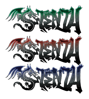
Graphic designing is important for artist looking into careers like graphics designer, Video game designer, and possibly software design. Not only does graphic design help in careers, but also it helps in many other situations. Graphic design could be used for a job resume. Determining the equal space and layout throughout the resume to look as professional as possible. This may also be helpful for organization. Having all proper files and folders in the most convenient way possible.

The logo I’ve created is a “tribal” style dragon with graffiti text, and the entire logo reads “Stealth”. Dragons relate to me because they are wise, fast, precise, and swift. There are basically two parts to this logo, the dragon and the graffiti. The dragon represents a traditional artistic feel as the graffiti represents a city and street feel. By putting these two types of completely different cultures together, they create a well-balanced logo of both traditional and modern art, which dragons would represent.
I started creating this logo by drawing a few rough sketches about dragons. Unfortunately, I never used any of those sketches in this logo because they became too complex. As I’ve noticed, many popular company’s logos are very simple and mostly 2-d. I was unsure how I could possibly draw a dragon 2-d. Then I happen to come across tribal art, which is very simple but gives the same feel of a complex piece of art. Then I began to search tribal dragon drawings and began to work. I drew more sketches in different angles, shapes, and sizes. I also wanted this logo to have a street feel to it. Graffiti art was the first ideal type of artwork that came to mind.  I decided to create this logo based on a gaming merchandise brand named “Razer”. Since this brand is based on gaming merchandise, I've decided to name my brand “Stealth”. In many tactical, strategy, adventure, and action games, "stealth" is a crucial skill that must be used. Dragons are also quite stealthy themselves. At first, the whole logo was just black, which didn't really bring the two art styles together. I added a “pencil-sketch” texture and a gradient effect to the logo afterwards, which gave great balance between the two parts of the logo. The texture also gives a “sketchy” feel. The dragon and the text are lined up in a straight 90-degree line. The gradient line also shows a somewhat 35-degree line through the middle of the logo. The curved repeated lines in the dragon such as the scales, body, and tail show a sense of rhythm.
How I stared to create this logo was first sketching the outlines of the logo in my sketchbook. I then photocopied that sketch and traced it on “Adobe Illustrator”. For each different piece of the logo such as each letter of graffiti and the parts of the dragon, I made layers for. By creating layers for each individual part, I am able to freely move any part I want without interfering with other parts. By the time I finished tracing the whole logo, I coloured the whole logo black. Originally, that would be the final product, but I also had some free time, so I began to play around with my logo by changing the textures, colour, brightness, and eventually decided that this would be my final product.
I am proud of the end result that I've made for this project. I don’t think I could change this logo in any way. Having to finish this project made me increase my creativity and helped me learn more about the tools I used like Adobe Illustrator. I know that this will help me in the future.
            Here is an extra drawing of a cobra.

Logo Assignment (Dragon)

Read More


                                                                                                    Original Image


    Group Drawing


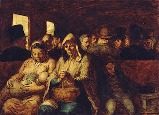
The "Year 1" CyberARTS class created a group drawing using "charcoal". We made a famous piece by "Daumier" called "The Third Class Carriage".

Daumier - The Third Class Carriage (Group Project)

Read More

Thursday, September 26, 2013

            The image that will be used is called “Infant Mortality” by Kollwitz.  This image shows a parent holding a small coffin with a baby inside it.
            Judging this image by a “Imitational” point of view, this image does not look realistic in any way. You can see the shapes made in the image and see that it forms a person and a small coffin, but it’s are only made with white lines which is not realistic. There are too many dark spaces around the eyeballs and you cannot see any body formed of the person. The coffin also does not look like a rectangular box because there are no outer lines to form an enclosed box. Realistically, the coffin looks like a bunch of different sized sticks floating over the parent’s hands.
            Judging the image “Formally” would be considered an average piece of art. Using the element of line doesn’t make the image complicated, and easy to understand. Not much shape and colour is shown in the image. There is no background to it and the body of the parent is also missing. Showing depth in the face shows the mood of the parent, which is weakness.

            "Emotionalism" show in the image would be graded a 5 out of 4 because of the many different types of expressions this image has. The large dark spaces around the whole parts of the face show a dark side of this parent. The face made as a skeletal form shows sorrow.  The boney skeletal hands the parent has also shows misery and despair as the hands hold the baby’s coffin. Showing a skeletal face and pair of hands shows weakness, as if the parent has nothing to live for anymore.

Infant Mortality Critique

Read More

Friday, September 20, 2013


            This image may only show vertical lines, but the image means much more. This picture lets you imagine what the picture could be, instead of what it should be. It’s almost like looking at stars and looking for any connections between them to form an image.
            The lines in this picture are obviously vertical but if you haven’t noticed, each line has a specific type of thickness. The line in the middle of the picture is the thickest line out of the whole image. The rest of the lines begin to get thinner as they get closer to the edge of the picture. This gives the image ‘proportion’. The lines could represent objects in proportion, or they could be connected somehow creating form and shape. All these lines are also strangely straight 90 degrees. These lines are also spaced apart from each other in many different distances; some of the lines are far from each other and some of them are almost right beside each other. Looking at this picture, you can’t really tell which direction they are pointing. They could be pointing upwards to the sky, or pointing downwards to the ground. These lines could even be pointing at the viewer. The picture may not have much movement so it is a “steady

            The way I made this image was by creating a two-point perspective based image, then I erased everything except for all the vertical lines. The actual image before this one was just made of many straight buildings. Having to only look at vertical lines from an original image give a completely different feel and completely different thoughts. The mood of the image cannot be described well because of the simple thick and thin, black and white lines. The mood could be despair and sadness or it could be a continuous happiness.
             The second picture is an abstract dynamic design. I started by sketching many abstract designs that was inspired by “Nujabes” cover art for his albums. The flow of the image starts at the right middle border when 4 lines rhythmically move downwards. Then lines right above curve around to the top right corner of the image. The lines at the top left corner give the image balance because if those lines were not there, then the movement of the image would only be going one way. Instead of looking at each individual line, start from one area to the next. You may not think the image is balanced but the movement of the image is actually moving in a oval shape, almost circular. Most of these lines are just copy and pasted like the 4 lines at the bottom half of the image, and the top left corner.

Repetition and Rhythm Assignment

Read More

Copyright © 2014 Kardryn CyberARTS | Designed With By Blogger Templates | Distributed By Gooyaabi Templates
Scroll To Top