 Graphic designing is
important for artist looking into careers like graphics designer, Video game
designer, and possibly software design. Not only does graphic design help in
careers, but also it helps in many other situations. Graphic design could be
used for a job resume. Determining the equal space and layout throughout the
resume to look as professional as possible. This may also be helpful for
organization. Having all proper files and folders in the most convenient way
possible.
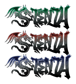
The logo I’ve created is a
“tribal” style dragon with graffiti text, and the entire logo reads “Stealth”.
Dragons relate to me because they are wise, fast, precise, and swift. There are
basically two parts to this logo, the dragon and the graffiti. The dragon
represents a traditional artistic feel as the graffiti represents a city and
street feel. By putting these two types of completely different cultures together,
they create a well-balanced logo of both traditional and modern art, which
dragons would represent.
.png) I started creating this
logo by drawing a few rough sketches about dragons. Unfortunately, I never used
any of those sketches in this logo because they became too complex. As I’ve
noticed, many popular company’s logos are very simple and mostly 2-d. I was
unsure how I could possibly draw a dragon 2-d. Then I happen to come across
tribal art, which is very simple but gives the same feel of a complex piece of
art. Then I began to search tribal dragon drawings and began to work. I drew
more sketches in different angles, shapes, and sizes. I also wanted this logo
to have a street feel to it. Graffiti art was the first ideal type of artwork that came to mind.
I decided to create this logo based on a
gaming merchandise brand named “Razer”. Since this brand is based on gaming
merchandise, I've decided to name my brand “Stealth”. In many tactical,
strategy, adventure, and action games, "stealth" is a crucial skill that must be
used. Dragons are also quite stealthy themselves. At first, the whole logo was
just black, which didn't really bring the two art styles together. I
added a “pencil-sketch” texture and a gradient effect to the logo afterwards,
which gave great balance between the two parts of the logo. The texture also
gives a “sketchy” feel. The dragon and the text are lined up in a straight 90-degree
line. The gradient line also shows a somewhat 35-degree line through the middle
of the logo. The curved repeated lines in the dragon such as the scales, body,
and tail show a sense of rhythm.
I started creating this
logo by drawing a few rough sketches about dragons. Unfortunately, I never used
any of those sketches in this logo because they became too complex. As I’ve
noticed, many popular company’s logos are very simple and mostly 2-d. I was
unsure how I could possibly draw a dragon 2-d. Then I happen to come across
tribal art, which is very simple but gives the same feel of a complex piece of
art. Then I began to search tribal dragon drawings and began to work. I drew
more sketches in different angles, shapes, and sizes. I also wanted this logo
to have a street feel to it. Graffiti art was the first ideal type of artwork that came to mind.
I decided to create this logo based on a
gaming merchandise brand named “Razer”. Since this brand is based on gaming
merchandise, I've decided to name my brand “Stealth”. In many tactical,
strategy, adventure, and action games, "stealth" is a crucial skill that must be
used. Dragons are also quite stealthy themselves. At first, the whole logo was
just black, which didn't really bring the two art styles together. I
added a “pencil-sketch” texture and a gradient effect to the logo afterwards,
which gave great balance between the two parts of the logo. The texture also
gives a “sketchy” feel. The dragon and the text are lined up in a straight 90-degree
line. The gradient line also shows a somewhat 35-degree line through the middle
of the logo. The curved repeated lines in the dragon such as the scales, body,
and tail show a sense of rhythm.  How I stared to create this
logo was first sketching the outlines of the logo in my sketchbook. I then
photocopied that sketch and traced it on “Adobe Illustrator”. For each
different piece of the logo such as each letter of graffiti and the parts of
the dragon, I made layers for. By creating layers for each individual part, I
am able to freely move any part I want without interfering with other parts. By
the time I finished tracing the whole logo, I coloured the whole logo black.
Originally, that would be the final product, but I also had some free time, so
I began to play around with my logo by changing the textures, colour,
brightness, and eventually decided that this would be my final product.
I
am proud of the end result that I've made for this project. I don’t think I could
change this logo in any way. Having to finish this project made me increase my creativity
and helped me learn more about the tools I used like Adobe Illustrator. I know
that this will help me in the future.
Here is an extra drawing of a cobra.


0 comments:
Post a Comment